Learn to Golf Programme Guides 
Sample level page 
Programme Player Pathway Infographic 
Sample level instruction page 
Programme structure 

Interior view of competition scorecards 
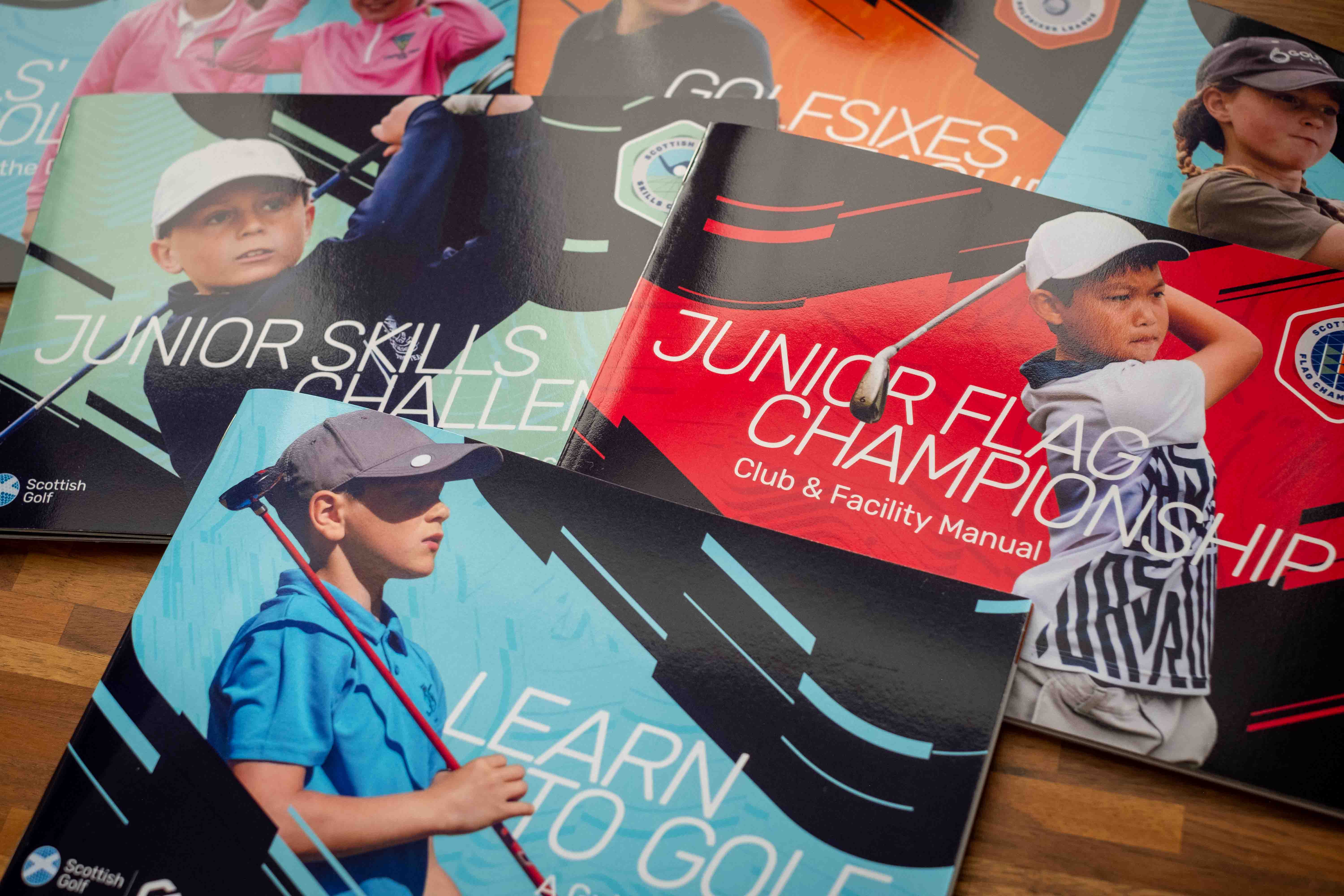
Junior Skills Challenge guide and scorecard 
GolfSixes guide and open scorecard 
Junior Flag Championship guide and scorecard 
Junior Flag Championship guide and scorecard detail
Project Summary:
Scottish Golf asked me to create a vibrant new identity for their Learn to Golf platform — a national programme introducing beginners to the sport. I developed a new brand system featuring a new logo, colourful sub-brands, print and digital materials, and an editable Canva toolkit for their internal team. The refreshed brand brings energy, clarity, and scalability to their participation initiatives.
- Project Overview
- Background & Objectives
- Discovery & Research
- Concept Development
- Refinement & Finalisation
- Final Project Reveal
- Outcome & Reflection
1. Project Overview
Client: Scottish Golf, the national governing body for the sport in Scotland
Industry: Golf, Youth Sports
Project Type: Brand & supporting design collateral
Scope of Work:
- Logo design and brand guide
- Sub-brand icon system for programme levels and competitions
- Print materials: guides, posters, certificates and scorecards
- Editable digital templates for scoresheets and certificates
- Templates and brand toolkit for social media posting
2. Background & Objectives
Scottish Golf’s Participation team introduces and guides players of all ages from their first time on the tee to earning their official handicap. They built and offer the “Learn to Golf” programme, a digital platform that guides junior golfers through a five-level development structure.
Challenges:
- Create a new brand identity for the Learn to Golf digital platform that complements but stands apart from the overarching Scottish Golf brand.
- Organise a series of fragmented instructional materials into a cohesive, scalable ecosystem.
- Provide a sustainable alternative to past progression incentives (e.g. wristbands).
Key Goals:
- Design a recognisable, standalone logo and sub-brand system for the five programme levels and competitions to encourage gamification while reducing environmental impact.
- Develop cohesive print and digital materials to educate and engage both young players as well as their parents and instructors.
- Create certificates, scorecards, promotional posters, and a digital asset bank, using Canva, for internal teams to expand and create new materials on the fly.
3. Discovery & Research

Insights from Client Discussions:
The programme should feel grassroots, energetic, and inviting — *not- performance-driven or intimidating. The goal is to inspire broad participation, especially from underrepresented groups. Materials should be vibrant and youthful, appealing to ages 5–18, while still educating parents and coaches.
Market Position: The brand needed to balance fun and accessibility with a sense of instructional growth.
Competitor Research
- TopGolf: Fun and vibrant, but more adult-focused.
- GolfIt!: Youthful, colourful, and energetic — closer to our target feel.
- England Golf: More education-focused but lacked the visual appeal that children could emotionally connect with.
Brand Adjectives:
- Instructive
- Approachable
- Clean
- Personality-driven
- Exciting
- Bright
- Youthful
- Active
Inspiration Sources:
- Nike and Apple Fitness achievement badges
- Geometric shapes to symbolise the building blocks of learning
- Clean, bold online educational resources
- Engaging photography showing teamwork and active participation
- Incorporate the Scottish Golf colour palette with updated accent colours (green, amber, red, black)
4. Concept Development
Sketches and Concept Proposals:

Concept options presented to the client 
Learn to Golf Mind Map 
Learn to Golf early logo sketches. I initially explored an acronym-based logo (“LTG”) to help familiarise users with the programme name. However, I transitioned to a stand-alone logo mark to better reflect the programme’s energy and learning spirit without relying on typography alone.
Option A. Player Striking a Ball:
- A dynamic mark that reads as both a player swinging and a club striking a ball.
- Implies action, and energy, while subtly referencing the “L” in “Learn to Golf.”
Option B. Building Block “G”:
- A stylised “G” integrating a ball sinking into a hole.
- Symbolises the progression and development stages.
- The hexagonal block subtly connects to the Scottish Golf logo’s hexagonal golf ball pattern within its logo mark.
5. Refinement & Finalisation


The client selected Option B: a hexagonal “G” that cleverly represents golf, education (the building block concept), and the dynamic movement of a ball in play. I tilted the initially more literal G shape in the final version to convey energy and forward momentum. To maintain brand cohesion, I used Scottish Golf’s existing Rubik typeface for the primary Learn to Golf logo.
Sub-brands, inspired by Apple Fitness badges and US Scouts achievement patches, extend the brand system. Each level and competition has its own geometric badge, colour palette and pattern — symbolising the specific achievements required for progression and reinforcing a “learning through play” philosophy. This visual structure introduces gamification, encouraging players to collect badges as they advance.
Level & Competition milestones:
- Level 1: Complete 3 short holes, unlimited shots.
- Level 2: Complete 3 short holes, in 25 shots or less.
- Level 3: Complete 6 short holes, in 36 shots or less.
- Level 4: Complete 9 short holes, in 54 shots or less.
- Level 5: Complete 9 full holes, in 60 shots or less from forward rated tees.
- Skills Challenge: Lines relevant to yardages of Drive.
- Flag Championship: Lines and traffic light colour system. Nine flags in image reflecting the nine holes played.
Each competition badge reflects the colours of the programme levels that a player should ideally have achieved before participating. For example, players are encouraged to enter the Skills Challenge only after demonstrating proficiency in Level 2 skills. An alternate, single-colour outline version is available for potential print needs as well.
6. Final Project Reveal
1. Logo System & Brand Guide:
I showcased the final logo across multiple use cases. The brand guide outlines full-colour, black-and-white, and responsive variations, ensuring flexible logo uses across all mediums.

2. Print Materials:
Custom guides, certificates, posters, and scoresheets were developed to align with each level of the programme. Landscape A5 guides, designed for portability, use distinct colour palettes while maintaining a cohesive look and feel.


3. Digital Materials:

To future-proof the brand, I built a digital version of their brand guide with a comprehensive suite of Canva templates. These allow the internal team to easily create social media posts, email content, and programme certificates — all within a consistent, professional framework. With the brand guidelines and assets accessible in the platform, the team can quickly adapt or remix assets as needed. This setup ensures both speed and consistency, especially when producing time-sensitive materials like competition certificates or event promotions. While I continue to provide support when needed, the client now has the flexibility and tools to produce content with confidence.


Canva’s custom Brand Kit functionality enabled me to set type styles, colours, and logos for seamless application across all assets. Much of the print collateral was also re-developed for Canva, allowing the client to create multiple certificates on the fly at competitions and publish brand-aligned content in minutes.
I created editable templates for:
- Certificates
- Social media posts
- Email headers and branding assets
- Scoresheets
- Promotional posters
7. Outcome & Reflection
Client Feedback:
“Working with Lauren has been a fantastic experience! We collaborated on a lengthy project that focused on a full redesign of our content and resources. From the first step, Lauren was on hand to provide exceptional guidance and creativity and turned what was just a small idea in our heads into a brilliantly designed and engaging batch of resources to share with our partners and clubs. Her communication was excellent throughout, and despite multiple moving parts over the course of the project, Lauren has done a brilliant job of keeping us updated on progress and tasks.
— Murray MacKenzie, Scottish Golf
… Furthermore, Lauren created bespoke templates inline with our new brand kit – and provided useful training – on the Canva programme, allowing us as a department to create and tailor our own pieces in an extremely easy to use fashion…
I would have no hesitation in recommending Lauren to anyone and I am looking forward to working with her more in future!”
Project Outcomes:
The refreshed brand brought excitement, clarity, and professional polish to Scottish Golf’s Learn to Golf platform. Feedback has been overwhelmingly positive, and the system’s adaptability is supporting continued growth across new initiatives and competitions.
Reflection:
This project helped me solidify my instinct for balancing structure with creativity. I learned to trust my expertise and guide clients confidently through complex brand ecosystems. Planning for future scalability was key to this project’s success and will continue to inform my process going forward. I thoroughly enjoyed the challenge of bringing cohesion across a wide array of materials.
Looking for a fresh start for your brand?
I’d love to collaborate with you to create a brand identity that feels fresh, inspiring, and truly yours. Get in touch using my contact form — I’d love to hear what you’re dreaming up!